Introducing v13: the new look and feel of your search experience!
You asked, we listened, and we're delivering: v13, Site Search 360's latest update, comes with a greatly improved user interface and enhanced performance to help you turn browsers into buyers.
A simpler and more intuitive design💡
Site Search 360-v13's new interface is a feast for the eyes (besides further improving your users' search experience on your website).
We've revisited the default styling of every search element and opted for a lighter and tidier look and feel, while still giving you the freedom to customize as you see fit. Our new clearer layout, no matter what implementation style you use (embedding, layover, grid, or fullscreen), provides easier navigation from search to results.
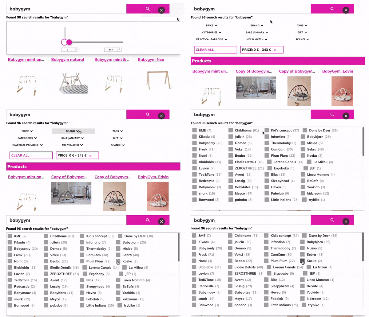
Here's a sneak peek into what you'll be getting after upgrading to v13:
More intuitive filters for a smarter organization of your products and/or services and enhanced UX.
Whether you display filters on top or on the left, your search results will benefit from cleaner-looking filter options and a more functional yet lighter feel.
Then...
And now...
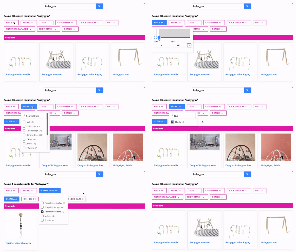
The added 'clear' option within a single filter type means that your visitors no longer need to deselect every filter value one by one when searching - easier browsing assured!
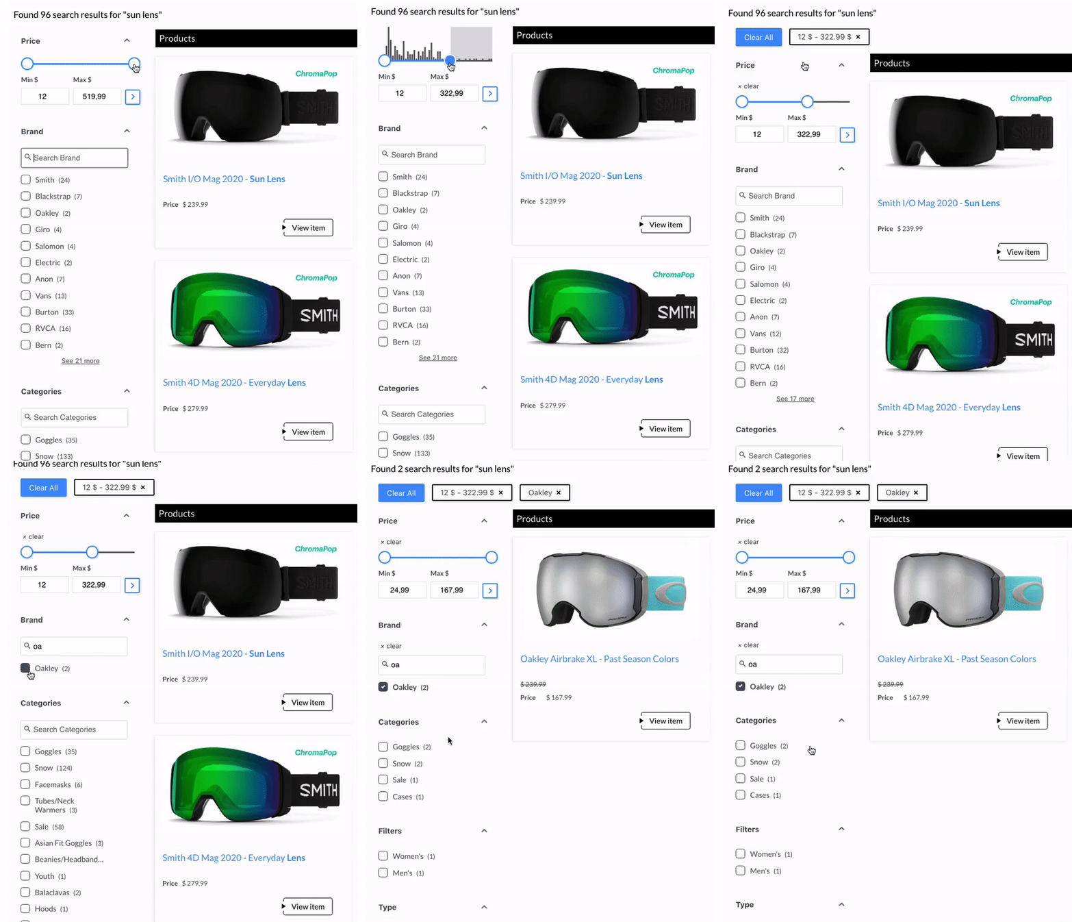
Also, in grid layout, images are now displayed above the title and the URL by default, thus making it easier to browse search results. There are also fewer visual break points because snippets are organized into unobtrusive yet easily distinguishable cards, helping you better highlight your products or services.
Then...
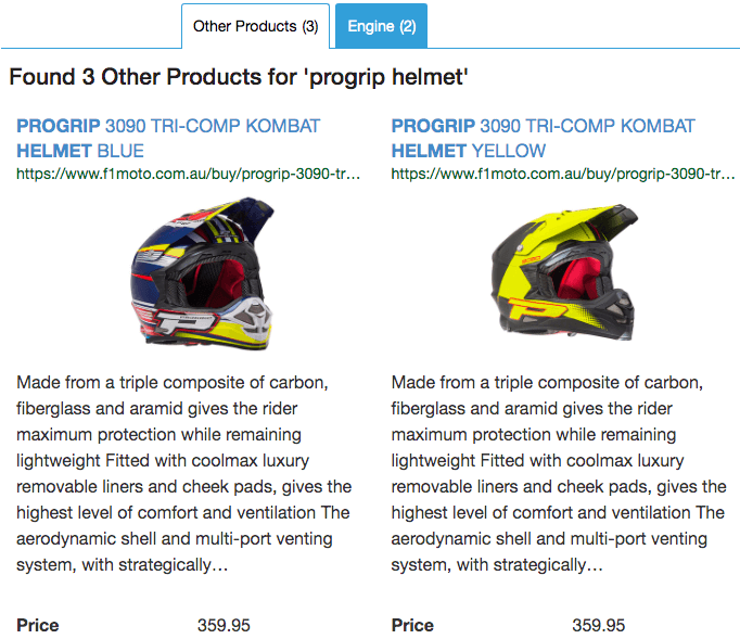
And now...
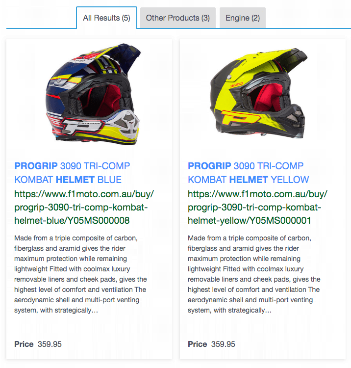
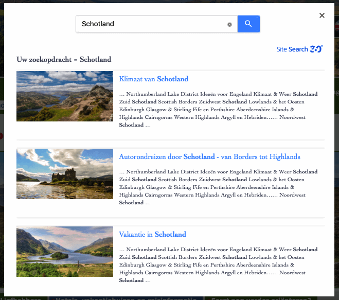
In layover view, bigger images and neatly aligned search results greatly improve the search UI and inject it with a modern user-friendly look.
Then...
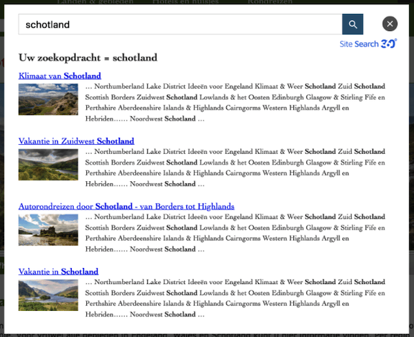
And now...
Fully customizable CTAs for your search result pages. You can now:
Change the button text
Add a custom icon
Adjust the link
Define what CTA is shown (or hidden) for every content group. For instance, you could use “View product” for product results and “Read more” for your blog articles.
Then...

And now: the choice is yours!
![]()
![]()
![]()
![]()
Easier navigation between content groups, now organized in tabs by default, and less scrolling required for a more efficient search. Additionally, a brand new 'All Results' tab includes all results from your different content groups (e.g. products, blog, etc.) in one handy location to improve your users' search experience.
Then...

And now!
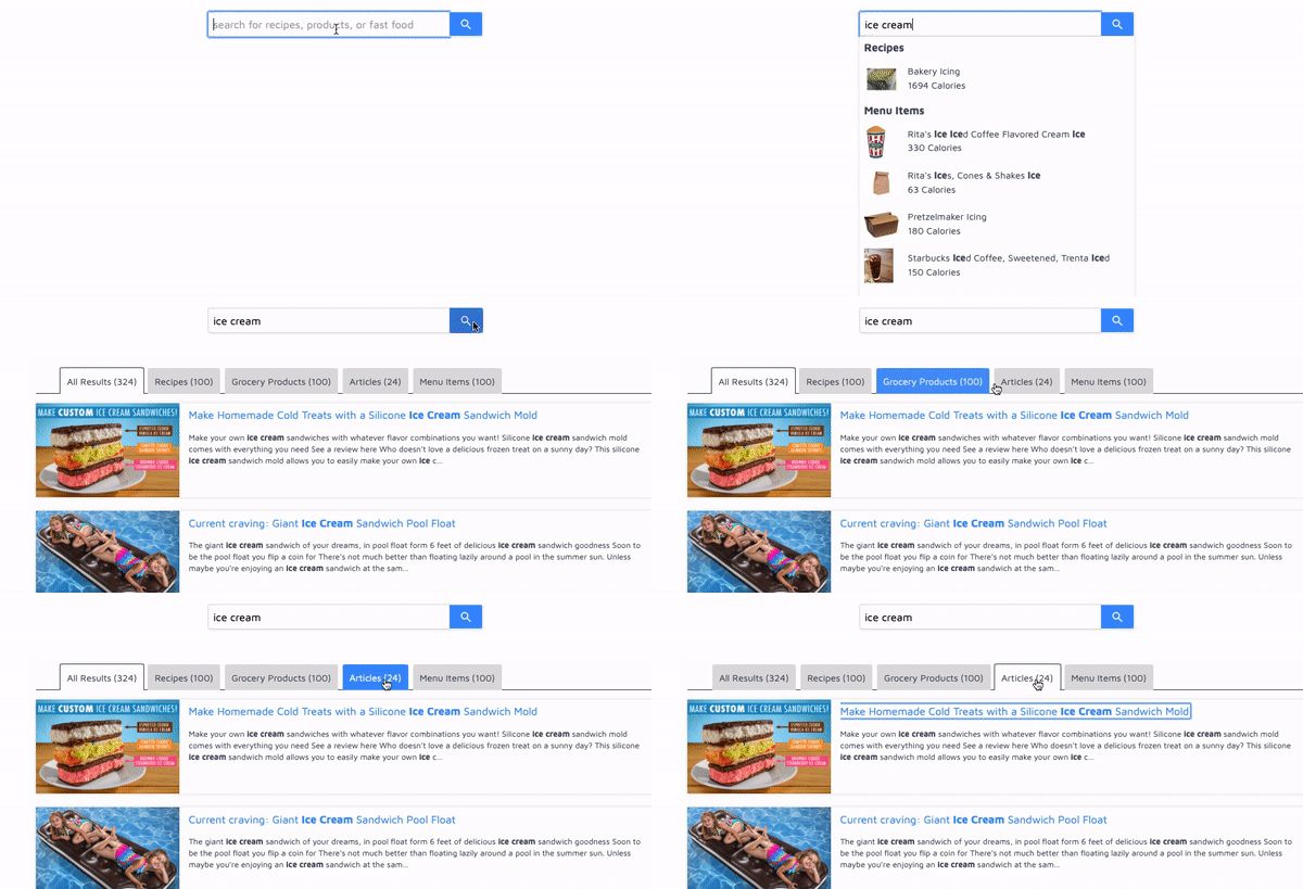
We keep your theme color for the main headings, filters, CTA button text and borders, and as a background color on some elements. But we've added a new Accent Color that is used for interactive elements such as:
- Result titles
- 'See More' results button
- Search button color behind the magnifying glass icon
- Hover-over content group buttons and tabs
- Active filter (when shown on top)
- Range filter slider handles and submit buttons
- 'Reset All' filters button
Keep our default accent color (light blue), or don't! You can set your own to complement the theme color and match your style so that your search result layout blends in with your website design flawlessly.
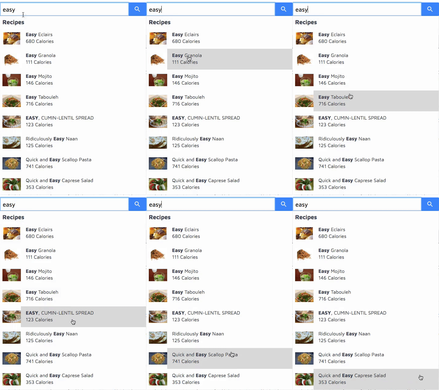
We've also improved the search suggestion UI.
Then...
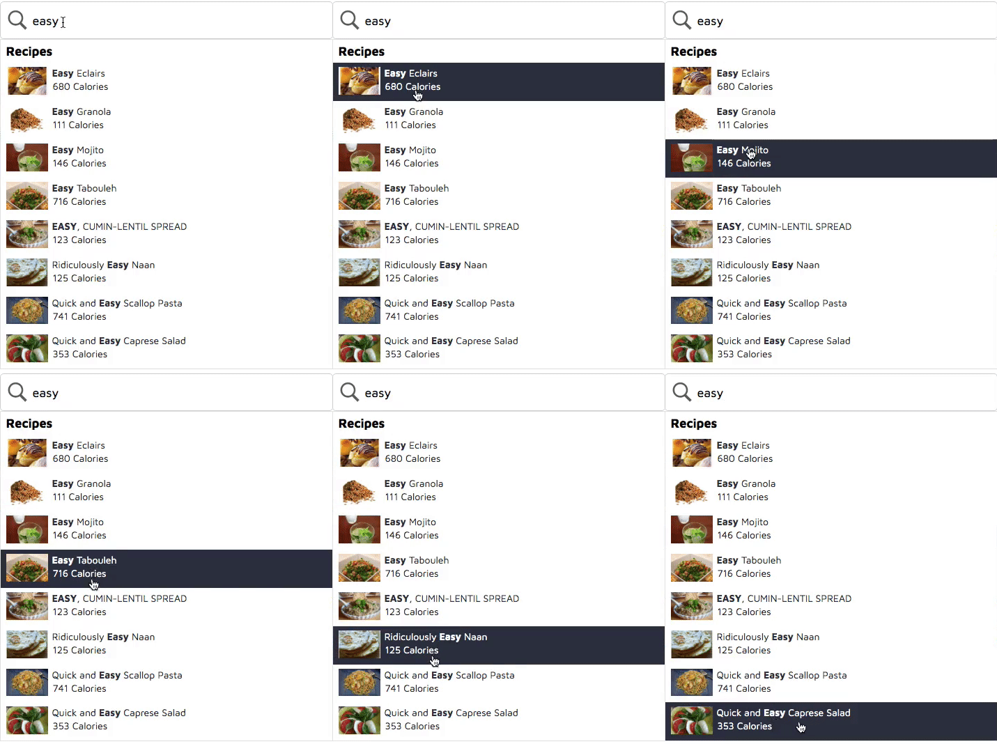
And now!
Code splitting and improved caching ↩️
Site Search 360 knows how a faster website increases search rankings and potential conversions! So with v13, we've also achieved about 30% faster rendering for your search results. This translates into a faster display of search options for your users and an optimized search experience overall.
Less paint flashing 🎨
Whenever your users interact with the browser (scrolling up/down, hovering, clicking, etc.), it needs to repaint the page content before it shows on screen. This might result in delayed rendering and visitors leaving your site before they've even checked your products or services – shock horror!
By lessening paint flashing for your site search, we've aimed at preventing unnecessary paints for faster rendering and deploying a smoother search function on your site.
Thus, v13 enhances both UX (User Experience) and UI (User Interface) in a master's stroke. To make the most of the above features, make sure you're running this latest (v13) script version.
Check out the release notes and upgrade your Site Search 360 for an optimal search experience now!
