Introduction
Ever seen a funny or inappropriate predictive search suggestions?
You know - when you start typing a search query and automatically a list of suggested searches pops up to save time. Sometimes the predictions are hilarious or downright strange!
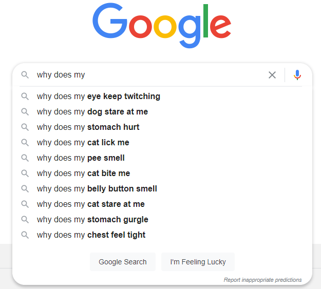
For example, try typing "Why does my" into Google search, and you'll get interesting autocomplete suggestions...

So what have we learned? People are curious as to why their pets keep staring at them. Maybe it's related to their twitchy eye, smelly pee, and ripe belly button... wo knows?
On a more serious note, search suggestions and predictive autocomplete features are commonplace these days. Most organizations that offer a lot of content or products on their website have a built-in search feature, including e-commerce, service providers, institutions such as banks and universities, etc.
But not everyone understands how search suggestions work.
Further, most people don't realize that the way in which predictive search suggestions are generated can be programmed and adjusted to more accurately match the intentions of the searcher.
But it's a topic that's worth researching, particularly if you're a business owner who wants to include site search on your website. It's understandable why you would want to do this - implementing on-site search increases conversions by 480% on average.
This article will shed some light on how search suggestions and autocomplete features work, with a special focus on structuring suggestions accurately. We'll also explore how optimizing search suggestions will help you enhance user or customer experience.
The language of search
Let's start by defining some of the common terms and phrases used when we talk about site search technology:
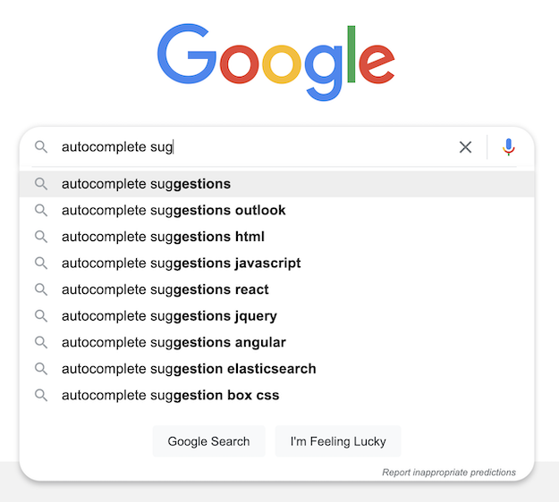
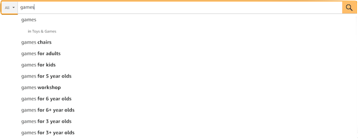
- Query suggestions or autocomplete - also known as recommended searches, suggested search terms, or typeahead, is a search feature that predicts the end of the search term as well as the next word or phrase as the user starts typing it.
Suggested queries appear in a dropdown menu below the serch box. They update as the user continues to type and more information is gained. The searcher can press the up and down arrow keys or click the mouse to select the suggested word or phrase without having to type them in full or continue typing if the autocomplete suggestion is not what they want.

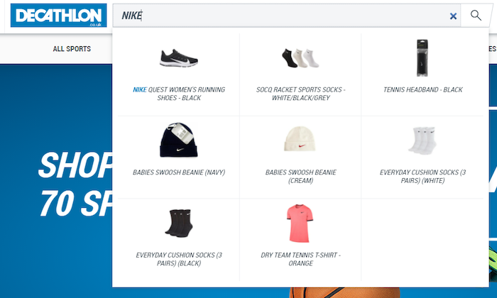
- Suggested results - also known as instant search results, these are search results that appear as soon as the person starts typing. For instance, on a clothing e-commerce site, if a user types "T" in the search box, a pop-up window may appear displaying popular or special offer T-shirts. If they continue to type "Ti" then a suggested result window containing tie-dye or tights may appear. If you select one of these, it bypasses the search results page entirely and takes the searcher directly to a product-specific landing page. So, in this case, instead of predicting search terms, the search box provides a set of best matches for products and resources:

- Some search terminology is interchangeable. For instance, predictive search suggestions and autocomplete are often referred to by other names such as search query suggestions, autosuggest, and search-as-you-type.
How are search suggestions and autocomplete powered?
Recent research revealed that 96% of major ecommerce sites now have built-in search function with autocomplete features.
Interestingly, the same research revealed that 27% of sites have poor autocomplete implementation and severe usability issues, making it detrimental to user experience.
That's why it is so important for any organization that offers an autocomplete feature to understand the mechanics of it and how it can be optimized to create the right impression on users.
Search suggestions and autocomplete all perform similar tasks - predicting the search query of the user as they type and providing best-matching search terms or results. This allows the users to click straight through the results without the need to type every letter, saving time and helping people get more effective search results.
Now onto the technical stuff. Most autocomplete programs apply a combination of syntax and AI or machine learning algorithms to pick out relevant suggestions from a database. Some predictive search features use frequent search data from content management systems to help refine queries by applying structured parameters and hierarchical lists. The most relevant results are then presented to the user in a dropdown list for the user to choose from.
However, the autocomplete program is coded, or whichever algorigthms and parameters it applies, there is one thing they all have in common - the structure of the search suggestions and design of the user interaction is fundamental to achieving good results.
Potential problems with predictive search
As mentioned earlier, up to 27% of sites implement flawed predictive search suggestion features. Let's take a look at some of the problems that get flagged up.
Gender bias and stereotyping have been raised as potential problems when it comes to search suggestions and autocomplete. A recent academic study highlighted significant prejudice in Google's predictive search, such as queries about older men being associated with sexual virility and romance, whereas suggested queries about older women were centered around changes in the body and health concerns.
Google has also come under fire for sexist, racist, and homophobic search suggestions. Of course, no algorithm is ever going to be perfect, and when the data set is as large as the one used by Google, some distasteful societal prejudices are likely to appear. But many experts, including renowned data scientists, suggest that companies do have an ethical duty to monitor and adapt their algorithms if discriminatory views are being suggested.
If you're a website owner who is looking to implement a site search feature that includes suggested search, you probably don't have to worry too much about the problems with prejudice listed above, but there are other potential problems that may affect your business.
One of the main problems people experience is poorly constructed suggested search features and user interfaces. This can seriously put visitors off and negatively affect your bottom line.
By comparison, well-implemented autocomplete suggestions that speed up search and offer a guiding hand with user searches can actually help improve user experience, increase customer retention, and boost profits.
The benefits of well-designed site search suggestions
There are a number of benefits for both the website owner (here we are assuming an e-commerce site) and the site visitor or customer.
The benefits for the customer include:
- Rapidly guide customers to the items that they want to find
- Improve customer experience by saving time and effort
- Increase customer awareness and knowledge
The benefits for the business owner include:
- Decreased bounce rate
- Improved customer satisfaction and loyalty
- Increased conversion rate
- Insighful analytics data on search patterns
- Increased opportunities to promote product lines and deals
- Applying A/B testing to provide optimized results
The benefits listed above just give you a sense of some of the advantages, and there are many more. By now you may be wondering - sounds great, but how do I actually achieve "well-implemented" search suggestions?
Glad you asked.
How to optimize site search suggestions and boost user experience
Research from the Baymard Institute revealed that 78% of users in mobile testing relied on autocomplete for assistance when using search features. This highlights how useful search suggestions are. But how do you get them right?
Site search suggestions, autocomplete, query suggestions - call them what you will - are all about making sure that search suggestions are both relevant and responsive.
At the end of the day, search suggestions are supposed to make life easier for the end-user, not more difficult or frustrating. And let's face it - getting search suggestions that are completely irrelevant or too slow to load are things that can really wind people up.
So, what does a good autocomplete feature look like? Here are a few things to consider when designing and implementing autocomplete:
Conversational flow
The best autocomplete features are almost conversational in the way that they flow. In other words, as the site visitor begins to type in the search bar, the autocomplete feature is a polite and intelligent personal assistant offering well-thought-out suggestions.
Enable Exploration
A well-executed autocomplete feature should allow people to gauge the range of the site or store's catalog (known as "probing") and get alternative suggestions that may not have even been on their radar (known as "exploration"). In other words, the search suggestion can open new avenues and ideas to the user rather than taking them on a linear path to their intended search results.
Reassurance
The search suggestion should reassure the searcher that the catalog has the items that they searched for. If it doesn't reassure them right away, and do it convincingly, they will look elsewhere.
Optimize the UX
In terms of the user interface and UX, you need to make sure that the list of suggestions is just the right length - too long and it will be unmanageable or may not work well on a mobile device, too short and it may not contain enough choice for the user. It should also be easy to scan down the list and select the desired suggestion quickly and easily. Finally, depending on the type of products being sold, the list may also benefit from distinguishing between products and categories.

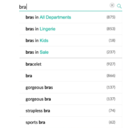
The example above shows how you can offset text in the suggestion box to highlight category choices. You can also use bold or italics to highlight other categories, features, or special offers. You can also include virtuals in your search suggestions to make products stand out, as demonstrated below.

Another important factor to get right when it comes to search suggestions is reaction time - it needs to be quick. Research has shown that the ideal delay is 0.1 seconds or less, as at this speed, the user will feel as though it is an instant response to their keystrokes. Reaction times longer than 0.2 seconds will appear to lag, and the user will perceive that there is a problem.
The anatomy of effective autocomplete
We asked our team of experts in the field of well-designed site search suggestions to put their heads together and come up with a comprehensive structure of the choices that go into creating a good query suggestion feature. This is what they came up with:
- Suggested searches, also known as keyword query suggestions - These are standard lists of popular keywords and phrases or trending search suggestions or recommendations based on recent searches. When implementing predictive search, there are certain things that need to be carefully considered and well-designed.
For instance, the interface needs to work well and display correctly across devices. Research shows that interfaces which automatically copy the active autocomplete suggestion across to the search box perform better with users than those that don’t.
The Baymard Institute research revealed that autocomplete is an important starting point for users. In other words, as the searcher starts typing, autocomplete allows them to customize or refine their query and continue typing. They may also use the up and down arrows on the keyboard to navigate the suggestions and “loop” through the list.
For example, a searcher may start typing “charger” into the search box and the suggestions box may come up with options such as “charger for iPhone” or “charger USB 3” or “laptop charger”, etc. It is useful for the user to automatically get “laptop charger” in the search box, but also to continue typing, e.g. “laptop charger for MacBook Air” or similar. They should also be able to cycle through the suggestions using the keyboard to get to the one they want before copying it to the search bar.
Additionally, it is important that the query suggestions are relevant and not redundant, as this may cause people to abandon the search and your site. Research shows that up to 23% of query suggestions have this problem.
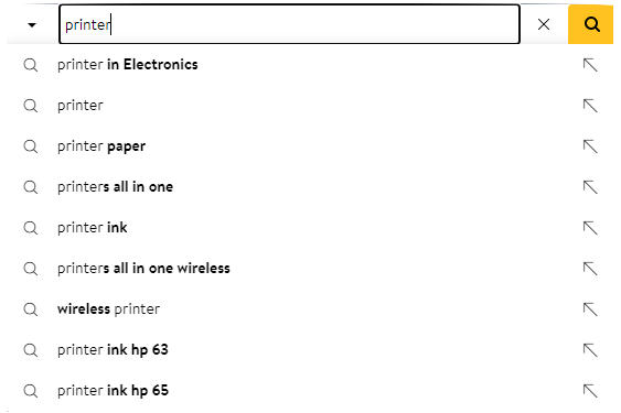
Here is an example of a well-designed and implemented suggested search feature from Walmart that has relevant category suggestions, and copies the active suggestion to the search bar when clicked. It is also fast and reactive when used on any device - another important factor to consider when it comes to implementing autocomplete.

The Walmart autocomplete feature also detects and makes suggestions to correct misspelled words, which also improves user experience.
- Grouped or scoped results - Grouped results are similar to the standard list, but also include other suggestions such as categories, brands, collections, etc.
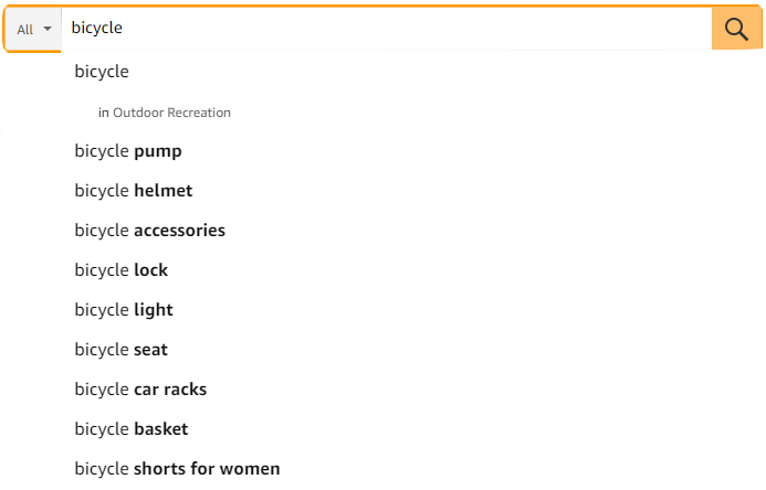
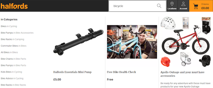
For example, if you search for something like “bicycle” on a sports equipment site, you may get a list of keyword phrases as well as brands and category groups such as cycling accessories, clothing, bikes, safety equipment, etc.
Compare the search suggestion results below - one from Amazon and the other from a UK-based bike seller. The predictive search feature of the latter is likely to outperform Amazon’s, as it offers customers a variety of categories as well as common keywords and search terms.


- Product suggestions - Predictive search suggestions can be set up to highlight certain products based on the search term a user enters. The items can be categorized by brand or type, or you can use suggestions to promote certain lines and special offers.
Clothing brands have become very adept at using this to their advantage.
For example, as you start typing a search term, the Louis Vuitton website displays categories as well as pictures and brief descriptions of products.

- Included data - These are lists of suggestions that also include some data points such as price, a short description, tag or label with more details, or simply the number of items available in that category.

- Call to action (CTA) - Some search suggestion lists end with a CTA to “see more results” or “view more products”. A good, clear CTA can improve the user experience, as they are invited to explore your site in more detail.
- Grids or lists? Images or plain text? Take a look at the screenshots above. The Louis Vuitton website uses a framed grid and product images for search suggestions, whereas Debenhams uses a straightforward text list. There are pros and cons to both approaches - the list is easy to read, not overwhelming, and will work well on any device. The grid offers more information, but it may be too much if designed badly, and it may not display well across devices. Therefore, it’s important to opt for a mobile-ready search solution that automatically displays the search layout perfectly on any screen size, such as Site Search 360.
- Don’t overdo the branding - It’s tempting to focus on using the search suggestion feature as an advertising channel. Remember - it’s a user experience feature first and foremost. If you over-emphasize specific products or brands and neglect t keywords, you’ll end up annoying or frustrating users, which is the last thing you want.
- Appearance and formatting - When it comes to the appearance of the search suggestions, there are plenty of decisions to be made. You can change the colors, formatting, text alignment, etc. The appearance can be optimized over time, with A/B testing used to get the best results, which involves trying an adjusted design with a percentage of users and comparing metrics such as click-throughs with the original.
Not just e-commerce
When people think about suggested search and autocomplete, it's usually e-commerce that springs to mind. This makes sense, as when you're searching for something to buy, suggestions are handy, and the e-commerce company benefits as they can use it as a sales and marketing tool, as we have already seen.
But there are other applications for site search suggestions. For instance, sites that contain a lot of information, making browsing through the sites to find what you're looking for take too long, such as can be the case for government sites, knowledge bases, universities, large blogs, etc.
An example of well-thought-out and useful search suggestions can be seen on the UK government website. To improve the quality of suggestions and search results, they introduced a search suggestion feature that offers alternative spellings of search terms based on actual web content rather than a dictionary.
For instance, before updating the feature, when somebody searched for "Falkirk" (a UK place name), the suggestions was "Did you mean flakier?", which, let's face it, is useful to nobody. It also highlights more helpful suggestions when people search for acronyms or terminology that are specific to the government. Improving and optimizing search suggestions to be more appropriate and useful upgrades user experience and gives a beter overall impression of the organization.
Here are some more examples of well-though-out and useful non-e-commerce search suggestion features:
Aston University

Aston University's autocomplete feature displays grouped search suggestions for research papers with a call-to-action to see all research results. They also provide an extra call-to-action to see the full search results.
Colorado Mesa University

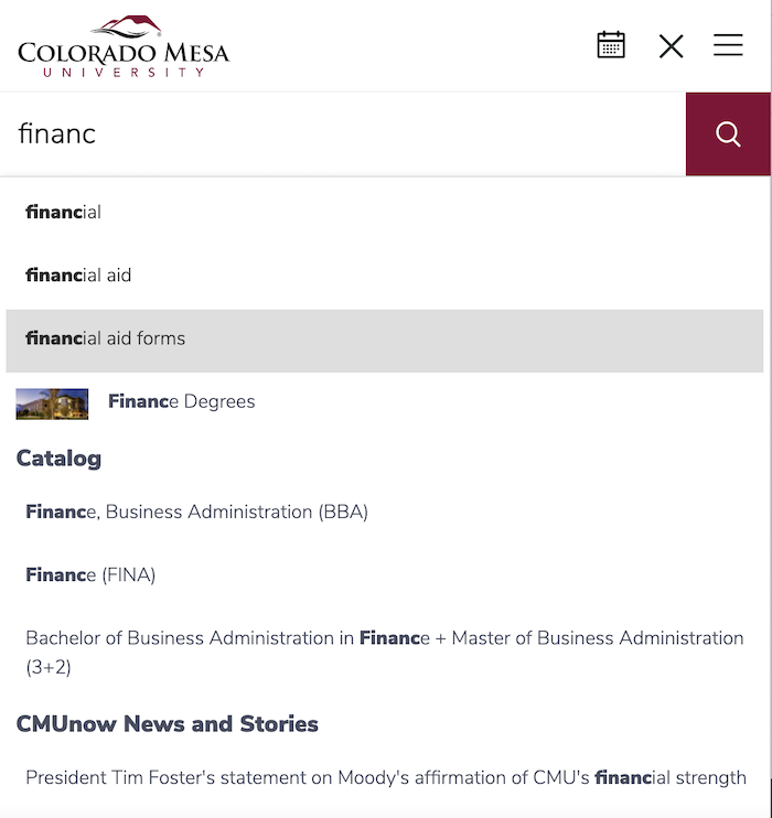
Sticking with the university theme, Colorado Mesa combines popular query results and top results from their catalogue. In doing so, they are providing a helpful keyword completion feature and directing people to promotional or important information at the same time.
Kemp Technologies

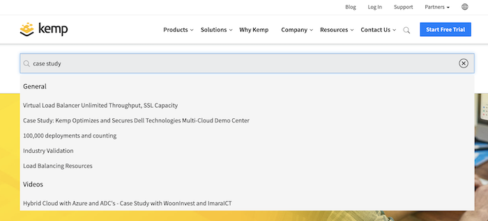
Kemp Technologies offers search suggestions based on top results while grouping them into different categories and media - case studies, articles, documents, and videos. This is really helpful for the searcher, as they can narrow their search down to exactly the type of content they are looking for. Site Search 360 can automatically group search suggestions by video as it automatically detects YouTube videos and categorizes them for search results.
Combining content, catalogue, and customer service searches
For the ultimate user experience, a well-executed and intelligent search suggestion feature should promote products, direct users to relevant content, and help with customer queries.
Most merchants have things like shopping guides, shipping and returns policies, blog posts, and YouTube videos spread across their website. In fact, most retailers and service businesses have content marekting strategies in place, with access to dozens, if not hundreds, of individual web pages.
You can align all of these different elements with a well-designed and implemented smart-faceted search feature (such as Site Search 360) that promotes and informs in equal measure.

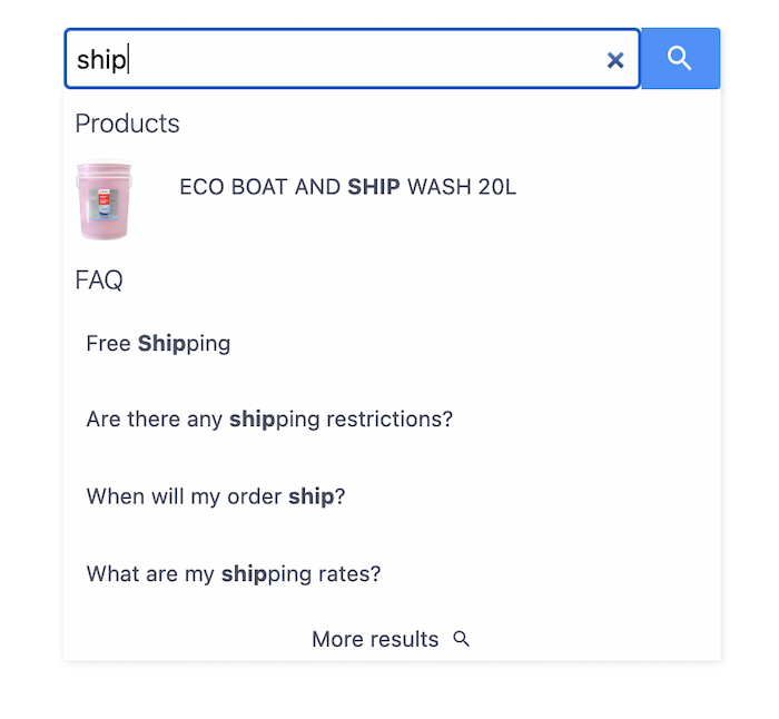
Offering both relevant product (ship wash) and FAQ results (shipping policies)
Boost your site search results and increase conversions
By now, you've probably realized that implementing site search suggestions or autocomplete features is a good way to boost your business, especially for e-commerce owners.
To help you get the most out of your site search suggestion feature, we've created a checklist that you can use.
Search suggestion checklist
- Is your autocomplete fast enough? Speed is important - it should load within 100 ms.
- Have you got the right amount of suggestions? Between 6 and 10 suggestions is believed to be optimal and used by many of the big companies - Google, Amazon, Ticketmaster, Ebay, Walmart, and Bing.
- Is it mobile-friendly? Needs to work seamlessly on mobile devices, including scrolling through and selecting suggestions.
- Does it show only relevant queries? Should be checked for relevance and also deduplicate queries - e.g. ladies shoes vs. shoes for women.
- Does it automatically optimize itself? Automatically learn which suggestions are popular and prioritize them, burying the ones that don't work.
- Does it show relevant meta-information? For instance, price, quantity, type, etc.
- Can it filter out offensive suggestions? Program the algorithm to make sure that offensive words or phrases don't show up.
- How are misspellings handled? Design it so that misspellings are recognized and suggestions highlighted.
- Is it intelligent enough to track user behavior and adapt suggestions? Include machine learning elements to optimize the query suggestions.
The above checklist can certainly help you implement an efficient search suggestion feature, but there are pitfalls and serious consequences if you don't do it right.
In fact, poorly implemented query suggestions may even decrease conversions.
That's why we recommend you get a team of experts to optimize your site search suggestions for you.
With over a decade's experience in the site search space, here at Site Search 360, we can offer everything you need - from a well-thought-out design and presentation to stellar implementation.
Get in touch today to discuss how we can boost your site search and help increase conversions.
